Disney animation uses color deliberately to tell stories without words. Every shade and hue carries emotional weight and narrative purpose. From Snow White’s yellow dress to Elsa’s ice blue gown, these color choices shape how audiences feel about characters and scenes.
How Disney Pioneered Color Storytelling
The first time color was used on purpose was in Snow White and the Seven Dwarfs in 1937. Disney animators employed different colors to show the difference between heroes and villains. The colors of Snow White’s dress were yellow, blue, and red, which stand for purity and innocence.
The Evil Queen wore purple, black, and green to show that she was envious. The forest sceneries used dark, indistinct shapes on purpose to make people more scared. This wasn’t an accident.
Disney used colors to show how people felt instead than just showing what was factual. The studio created a visual language that had an impact on animation for many years. In 1666, Sir Isaac Newton invented the color wheel. Disney turned it into a way to tell stories.
Studying Disney’s Visual Development
Disney’s Visual Development Artists craft characters and worlds using color as their primary tool. They create color boards and painted models before animation begins. These materials establish the emotional tone for entire films.
Animation students often analyze Disney’s color theory for academic assignments. Writing about color symbolism in Moana or Encanto requires understanding artistic techniques and narrative purpose. Students examining villain design can get support from EduBirdie to structure their film analysis essays effectively. These assignments demand clear explanations of color psychology with specific examples. The visual development team tests colors against various lighting conditions before finalizing choices.
Color consistency matters across every production department. Visual Development Artists champion color intent throughout filming. They ensure the original vision translates to the finished product.
The Warm and Cool Color System
Warm colors include red, orange, and yellow. These hues convey energy, passion, and excitement. Classic Disney princesses typically wore warm colors in at least one scene.
Snow White’s yellow gown and Cinderella’s pink ballgown followed this pattern. Belle wore gold in Beauty and the Beast’s ballroom scene. These choices made princesses feel approachable and warm to audiences.
Cool colors encompass blue, green, and purple. These shades create feelings of calmness or sometimes distance. Villains often wore cool colors mixed with black to establish their threatening nature.
Maleficent’s purple and black costume in Sleeping Beauty exemplified this approach. Ursula in The Little Mermaid combined purple with darker tones. The color palette immediately communicated their antagonist roles before they spoke.
The Lion King used warm, earthy tones like golds and oranges. These colors created warmth and nostalgia for the Pride Lands. Dark colors like greens and blacks conveyed danger during threatening scenes.
Inside Out took an explicit approach to color coding emotions. Joy appeared in yellow, Sadness in blue, Anger in red. Fear wore purple and Disgust appeared in green, creating instant visual understanding.
Cultural Evolution in Color Usage
Disney’s approach evolved beyond Western color interpretations. Mulan represented the studio’s first serious attempt to incorporate Chinese color symbolism. Production designers studied traditional Chinese art extensively.
Imperial city scenes used traditional combinations of red and gold. These colors carry specific cultural meanings in Chinese tradition. The countryside appeared in muted greens and browns for contrast.
Hun invasion sequences employed cold blues and grays. These colors represented threats to China visually without dialogue. The ancestral shrine sequence drew from traditional Chinese religious iconography.
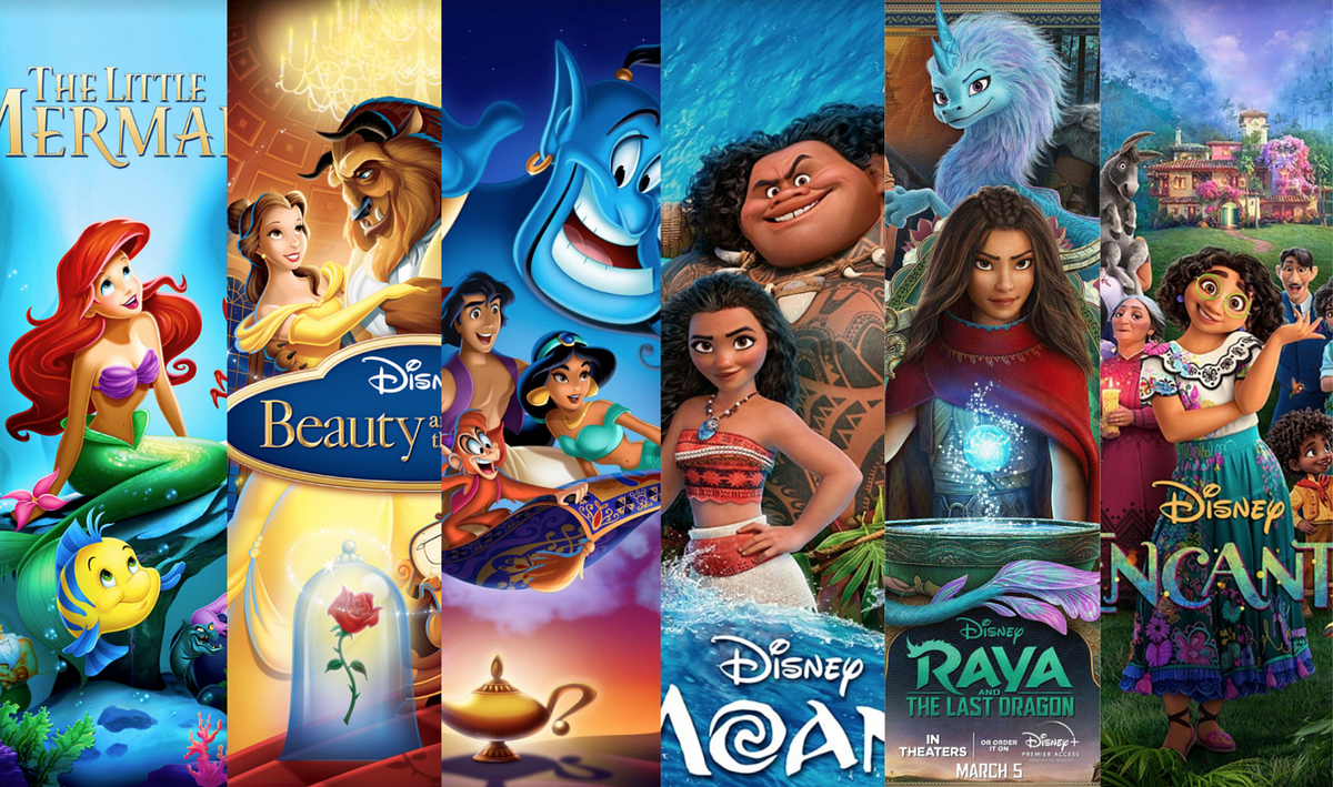
Encanto integrated Colombian color traditions into every frame. The vibrant palette reflected Colombian culture authentically. Production teams consulted cultural experts throughout development.
Raya and the Last Dragon incorporated Southeast Asian color traditions. Each region used distinct palettes representing different cultures. This approach required months of research and consultation.
Key Color Theory Principles Disney Uses
Disney animators follow specific guidelines when applying color:
- Characters typically use no more than three basic colors
- Warm colors advance visually while cool colors recede
- Color shifts signal emotional changes in the story
- Cultural color meanings require expert consultation
- Complementary colors create visual harmony
- Analogous schemes establish mood consistency
- Monochromatic palettes focus attention on movement
The “Go-Away Green” Philosophy
Disney Imagineering developed “Go-Away Green” for theme parks. This isn’t a specific shade but a philosophy about color use. Infrastructure painted in certain colors disappears into backgrounds naturally.
The concept extends to “go-away brown” and “go-away beige” depending on surroundings. Color designer Heidi Rosendahl emphasizes this approach in her work. She’s worked at Walt Disney Imagineering since 1995 developing these techniques.
The technique demonstrates how color affects physical perception. Background elements use colors that don’t compete with foreground action. Character colors pop against carefully chosen environmental palettes.
This same principle applies in animation production. Animators ensure main characters stand out from their environments through strategic color choices. These decisions direct audience attention to important story elements.
Character Development Through Color
Villains typically wear dark, menacing colors like black and purple. Heroes appear in bright, heroic colors like red and blue. This pattern became standard across Disney films for instant recognition.
Scar in The Lion King combines dark brown with black. His coloring contrasts sharply with Simba’s warm golden fur. Audiences understand their opposing roles immediately through color alone.
Character color associations become cultural touchstones beyond the films. Ariel’s red hair identifies her immediately across any medium. Elsa’s ice blue dress symbolizes her powers and became instantly recognizable.
The Cleveland Institute of Art recommends limiting character palettes to three basic colors. This guideline ensures characters read clearly on screen. Disney follows this principle consistently across productions.
Emotional Progression and Color
Color shifts indicate character growth throughout films. A character might start in muted colors and adopt brighter hues later. This visual progression reinforces development without exposition.
Rapunzel in Tangled starts in a pink and purple dress. After leaving the tower, her palette becomes more vibrant. The color shift reflects her growing confidence visually.
Elsa’s transformation in Frozen involves significant color evolution. She moves from contained, muted tones to brilliant ice blues. The color change visualizes her acceptance of her powers.
Disney animators plan these shifts carefully during storyboarding. Color progression maps track character emotional journeys throughout films. Each scene demonstrates deliberate decision-making about palette changes.
Technical Execution of Color Design
Visual Development Artists create comprehensive color documentation. Color boards show palette evolution across different scenes. Painted models demonstrate how colors work in three dimensions.
These materials guide every production department systematically. Modelers reference them for texture work decisions. Lighting artists use them to maintain color consistency throughout.
Digital animation tools now provide unprecedented flexibility during production. Artists adjust hues, saturation, and value instantly. However, the fundamental storytelling principles remain unchanged.
Modern productions like Wish continue evolving Disney’s approach. The film’s color palette draws from classic Disney techniques. Visual development art established these directions before animation began.
Encanto’s color work required extensive upfront planning. Each family member has distinct color associations throughout. The Casita itself uses warm, welcoming tones that shift during emotional moments.
Beyond Simple Color Associations
Black and white usage isn’t straightforward in Disney films. White appears rarely as a primary character color. Animal characters like Duchess and Pongo use white and all qualify as heroes.
Black typically signals villainy but usually mixes with cool colors. Cruella De Vil’s black and white hair creates striking visual impact. The stark contrast reflects her extreme personality traits.
Mother Gothel breaks traditional patterns by wearing a maroon gown. This subverts audience expectations while maintaining darker tones. Such choices demonstrate sophisticated understanding of color psychology.
The binary of black representing evil stems from cultural traditions. Modern Disney films increasingly challenge these associations. They incorporate diverse cultural color meanings from around the world.
Tiana in The Princess and the Frog wears multiple dress colors. Each outfit reflects different aspects of her personality. The variety breaks from earlier princess color traditions deliberately.
Learning from Disney’s Evolution
Early films like Snow White established color foundations that still influence animation. Mid-period films like Sleeping Beauty refined these techniques significantly. Contemporary films like Encanto demonstrate cultural sensitivity alongside technical mastery.
Each film teaches specific lessons about color application. The Lion King shows environmental color shifts between locations clearly. Inside Out demonstrates character color coding with psychological research basis.
Moana displays how vibrant palettes maintain visual clarity throughout. Despite complex backgrounds and character designs, strategic color choices keep focus clear. The ocean itself becomes a character partly through consistent color animation.
Frozen uses color to distinguish magical elements from realistic ones. Elsa’s magic appears in specific shades of blue consistently. This helps audiences track magical moments visually without confusion.
Zootopia employs distinct color palettes for different city districts. Tundratown uses cool blues and whites exclusively. Sahara Square features warm yellows and oranges throughout.
Color theory merges science and art to create visual effects. Disney transformed Newton’s color wheel from a scientific tool into narrative device. This transformation continues evolving with new technologies and cultural awareness expanding.
The hidden color theory behind Disney animation represents deliberate craft refined over decades. Every color choice serves story, character, and emotion purposefully. Understanding these principles reveals the artistry behind the magic that audiences experience.
Discover more from The DisInsider
Subscribe to get the latest posts sent to your email.


